When it came time to look at wedding paper goods and to design our wedding invitations, it turns out I got a late start. I rounded up a small handful of vendors that I liked and started reaching out only to get a barrage of rude responses and “sorry, can’t help you” replies. But, that wasn’t the case with Prim & Pixie. From the start, their team was responsive and easy to work with. I knew quickly that they were the partner for us for this important element of our wedding.
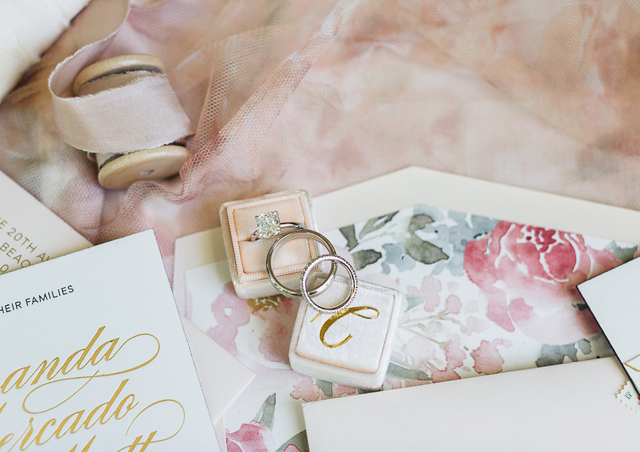
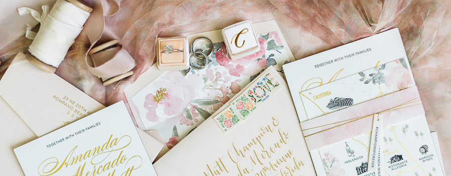
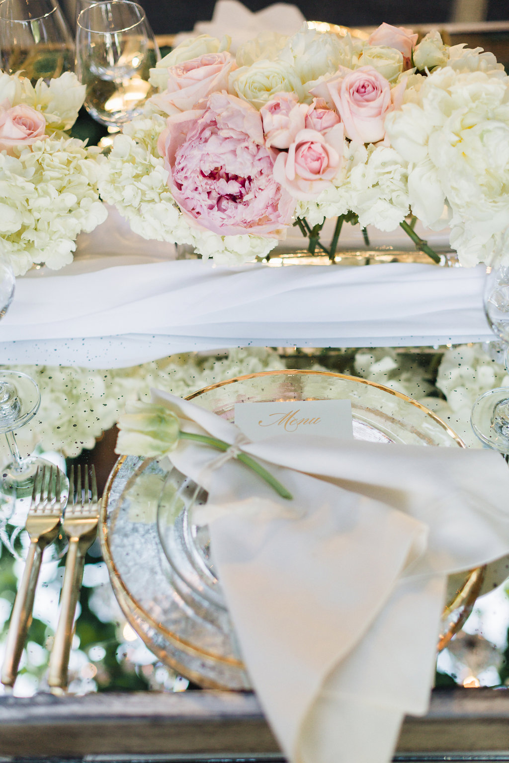
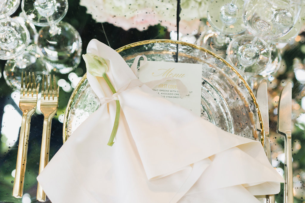
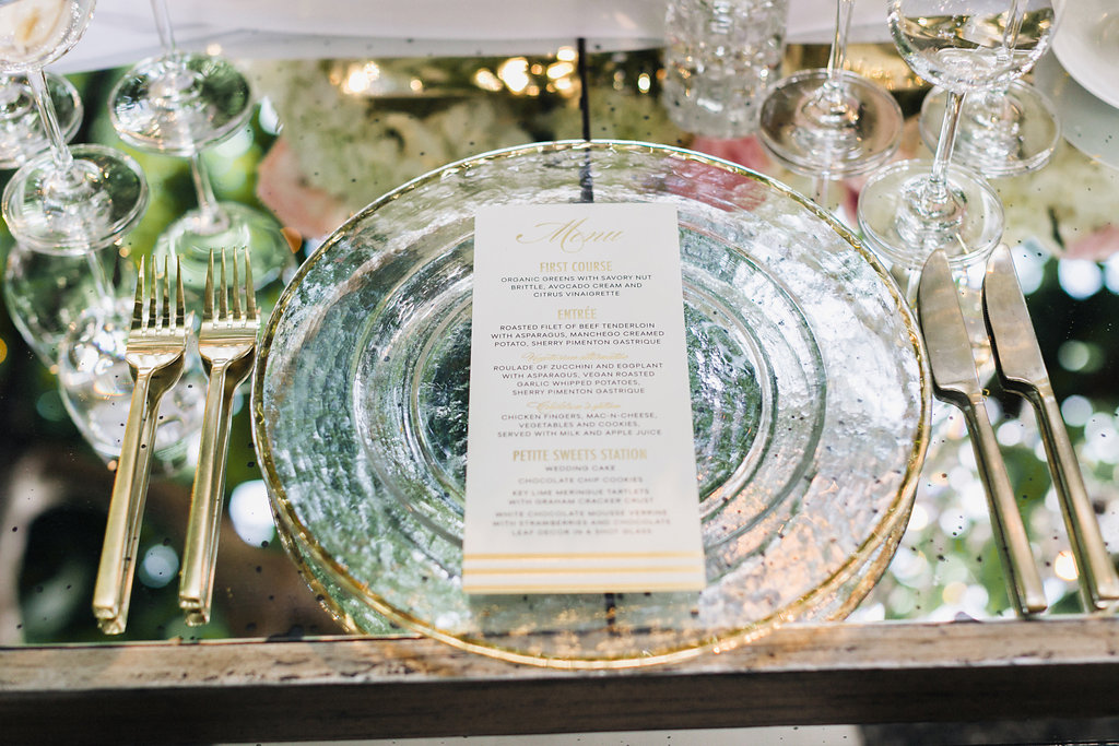
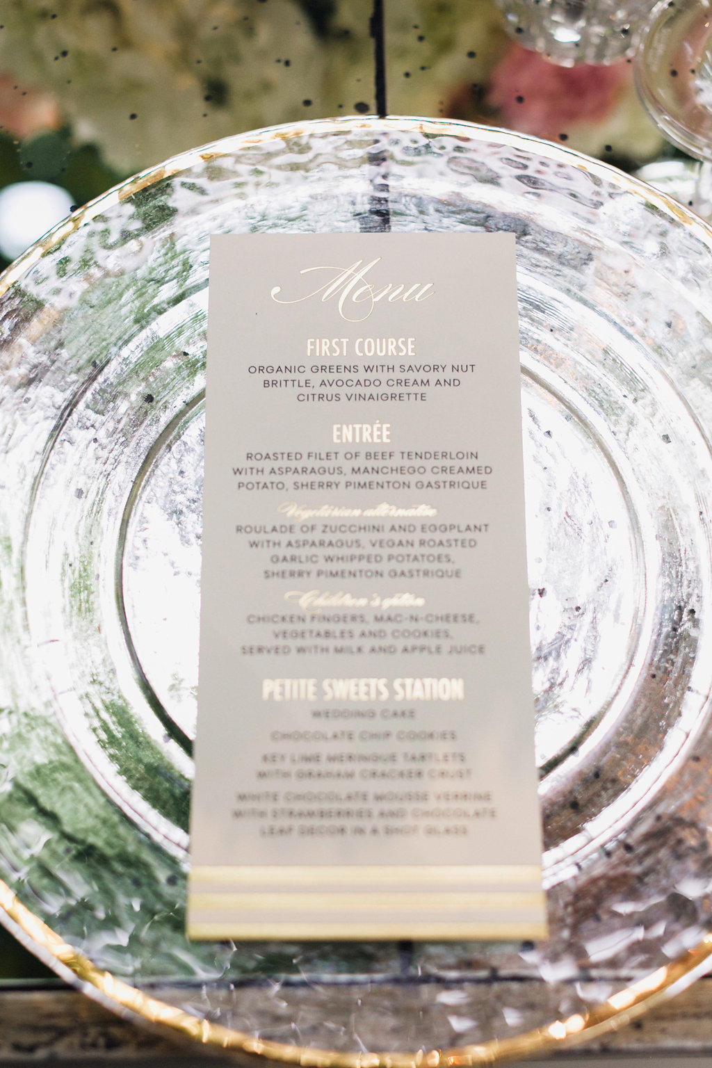
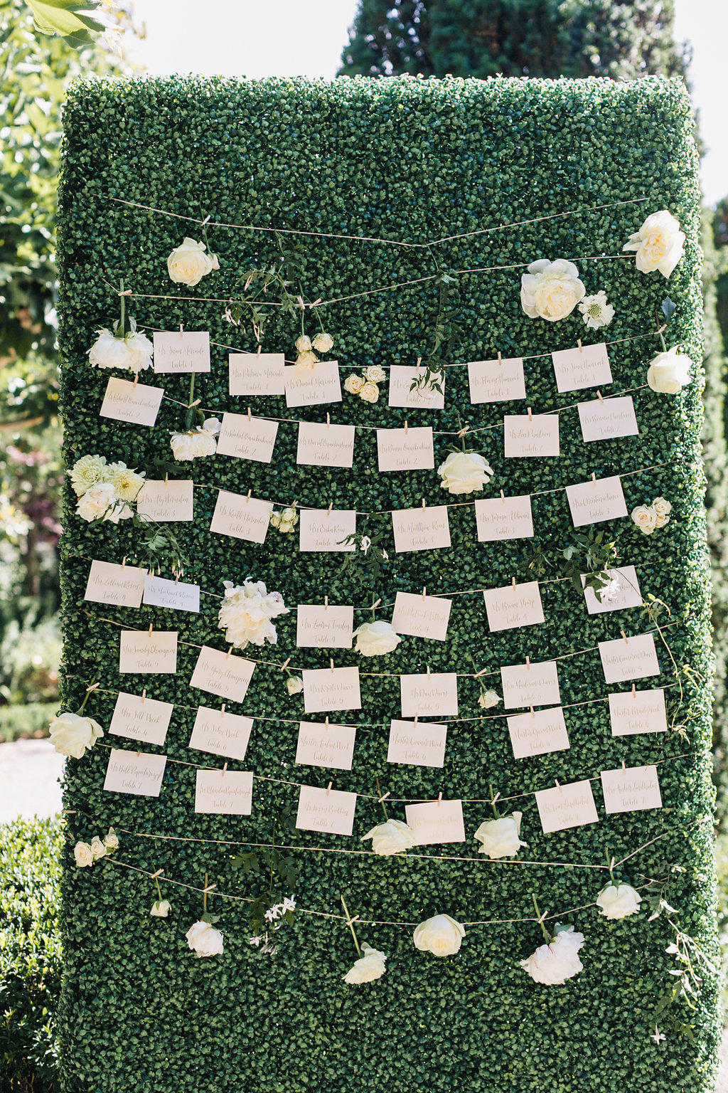
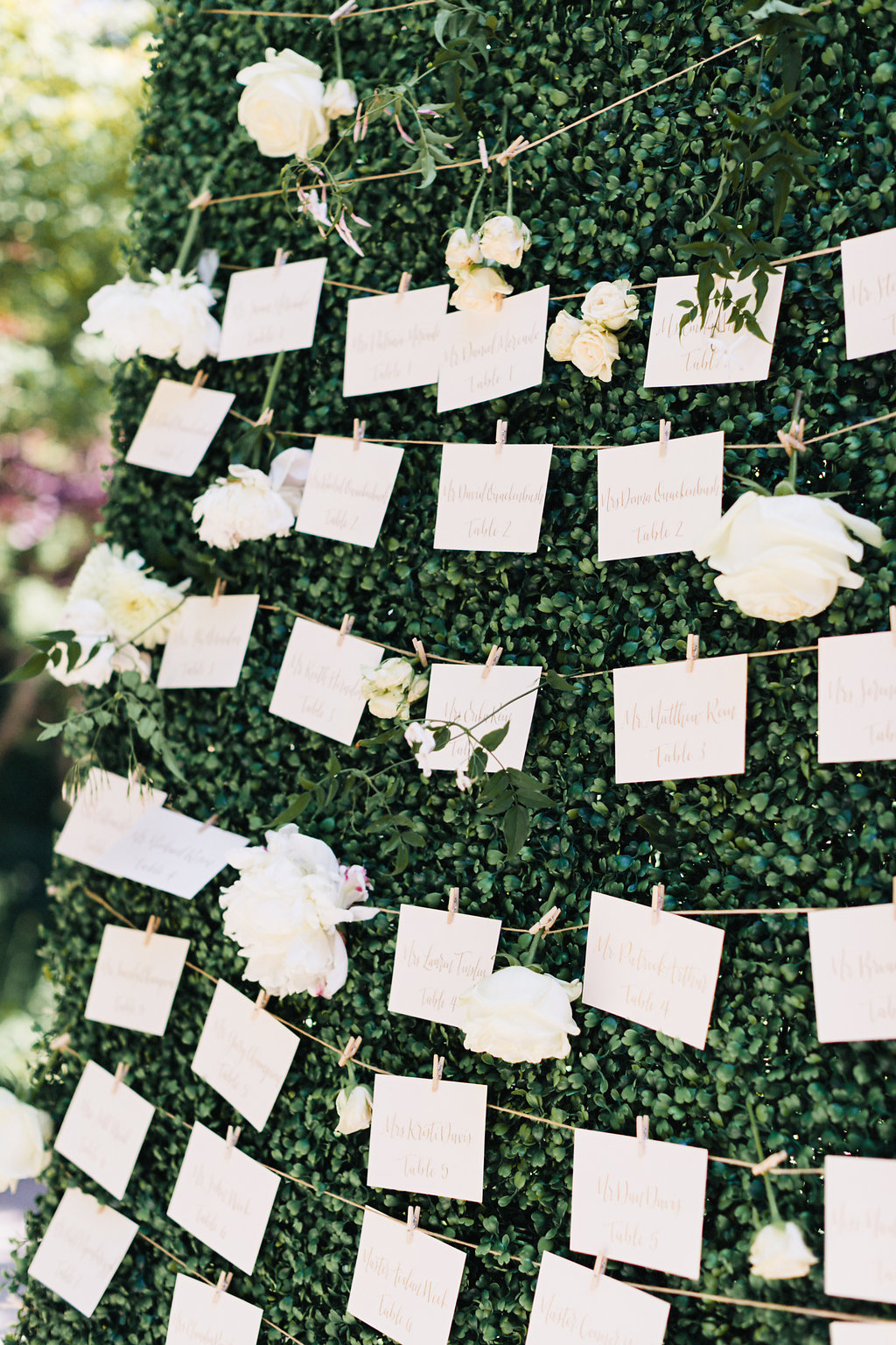
 Wedding invitation suite, wedding dinner menu, wedding placecards, Love You More sign: Prim & Pixie
Our Wedding Paper Goods
The decision to marry the the love of your life is easy! Then, you have to start planning all the little details! But, designing your wedding invitations doesn’t need to be overwhelming.
To find inspiration for our wedding paper goods, I created a handful of Pinterest boards like this one and this one. I knew Matt would want to have a say in the final product. So, making those boards would help him see trends in the style. Ultimately, we reviewed all the ones we liked so that we had a starting point with Prim & Pixie. I think that’s the biggest tip I recommend.
While we never really had official “wedding colors”, we chose to incorporate a lot of gold, white and blush tones into most elements. In wedding planning and in my personal style, I prefer clean lines and a chic look and feel. When it came to our wedding paper goods, it was no different.
One of the first questions that Jen and her team asked was what type of printing we wanted to use for our wedding invitation suite. I didn’t even honestly know where to start! I’d seen invitations printed on acrylic which I loved. But, those seemed a little too modern for our boho glam theme. In the end, we used a combination of letterpress and foil printing to add some texture. To make the invitation itself more substantial, we opted with a thicker paper stock. The gold foil on our invitation suite really helps them pop. Of course, our garden party theme had to come through as well! The blush florals on the envelop liner added a great touch.
I think it’s important to make the invitation suite speak about your affair and our map of events was by far the most fun part of this wedding planning project! The map of Napa included the major highways, our venue, the wineries we’d be visiting and the hotel. I’m going to frame it, along with the invitation, and put it up on my dresser.
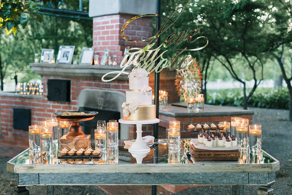
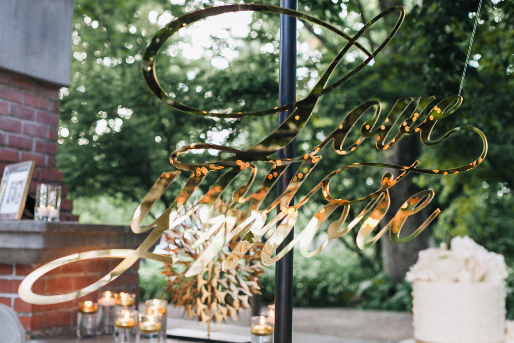
Last, but not least, was our “Love You More” gold sign. I originally thought we’d have a pretty sign over our sweetheart table. But, when we decided to hang chandeliers we wouldn’t need anything there. So, instead we asked Prim & Pixie to hang our favorite phrase above the dessert table and it was perfect.
Together, all of these elements made such a difference at our wedding and really made it our own. We can’t thank the team at Prim & Pixie enough for working with us and helping the design come together!
Questions? Ask me below in the comments and be sure to read our wedding story on Style Me Pretty!